Showing posts with label Fashion Label. Show all posts

Wednesday, November 24, 2010

DSW publication

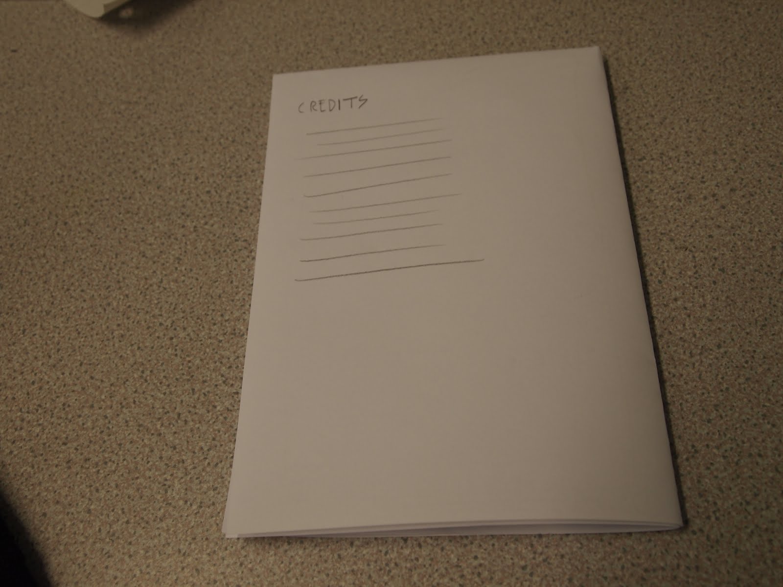
OK, so part of the brief called for a press release/portfolio of work that could be given out and mailed out to potential clients and even employers if she decides to become a designer for someone else's company. I did some quick paper mock ups of the forms that it could take, be it a fold out poster or a standard booklet.

So my first idea was to do a fold out poster with a splash page on one side and then the other information laid out on the other side in an interesting and well gridded way. Unfortunately the image quality of even the good photos that Daisy has sent mean that they're too small to make a full page spread with, eliminating this as an option.


The second format I could work with would be derived from folded down paper again, however, this time it would be stapled and cropped to make a standard A format booklet. I know that A format isn't particularly popular right now, but in a brief that involves real costing, then this is an effective and non-wasteful format to use.




I quickly began playing with the assests I'd collected over the course of branding Daisy to put together this publication. I started with the colorful logo I'd been using on the business cards, but I don't really like it this way. I simply chose the title works, although I played with collections. I think the issue with collections is that it descrbes only garments, where actually Daisy's work is as diverse as being a make-up artist and art direction, so 'works' seems like a more appropriate title, I ran it past Daisy and she really liked it so we're sticking with it for now untill she came up with something different.

Another thing to note is the website, which has actually changed a few times in terms of the availability of it, but DSWfashion.co.uk isn't taken and she's buying soon. I think this web name works really well on the cobver as it informs people exactly what the booklet is about.


I started working with a basic 8 column, 8 row grid with a view to using 2 columns per text box. If I need to make it more complicated then I'll change it as I go along, but this grid is nice and symmetrical and suits very crisp and minimal layout.


I worked on this as a splash page/ nice bit of colour that ties the book together and unites it with the rest of the stationary. If there's enough pages left over at the end, then this is definitely an option that I can go with.

Then I started playing around with titles and layouts but it was all a bit aimless really, Daisy wasn't able to give me much of the information I needed and I need her to send me some much better quality photographs if I'm going to produce the kind of high standard she wanted. What I do like about this start is the change in weights of the title, highlighting the About bit of the title. It kind of reminds me of the way with compliments was layed out on the compliments slip, which creates a nice bit of parity between the stationary and the booklet again.


One spread I was able to work on quite extensively and quickly was the alpha and omega t-shirts because they were a project I actually worked with her on, designing the prints for the garments she designed. I started with the title and again mimicked the with compliments slip. The images themselves created quite a nice mirror, so i started with a layout that reflected this, with the brief summary of the work mirroring the title. I tried a few other things out before deciding that I was really onto a winner with using the mirror idea. With that in mind, I reversed the photo on the right to further this effect even more. I think the themes of opposites in life and death are then reflected quite nicely in the mirror layouts.


Spurred on, I went back to the abouts page and contents. I decided to put in the picture that I'd extracted the colour from to make the compliments slip. The problem with this is that if I use that full colour splash page, then perhaps it's too much. It was also difficult to lay out the text on the page without the image behind really interfering with it.


The text I've been using throughout the body copy is 7 pt century gothic with +10 leading and 10 pt line spacing. This should be very readable but I'll obviously check this at a later date with some mock-up prints.


Finally, a mock up of a double page full image spread, but I'm not sure whether there will be space to do this kind of thing when all is said and done.


After doing most of this over yesterday, I realised I was quite confused and aimless and I needed some further direction so I had a meeting with Daisy this morning, where I went over exactly what she wanted in the book, and gave her apiece of paper with all the file requirtements on it: CMYK, 300dpi etc. below is a piece of paper where she's ordered the work she wants in the book into pages and she also wants the thign divided into sections, such as garment design, make-up/styling and art direction which I think is a very good idea, though this booklet is getting bigger than I initally thought it would be, meaning it may have to be 4 separate pieces of A3 paper folded down to A5, or 2 A2's done in the same way. It's good to have a road map and I'll stick to this untill/if it throws some problems up.

Show and Tell feedback

Here are a few photos from the show and tell session. Unfortunately because of the deadlines of the first and second years, I wasn't able to get into print for my cults brief in time, which I think is a shame because it felt like I hadn't got enough work. I did present the stationary for my DSW brief as well as my finished conspiracy theory book. I asked for feedback on what was working and what wasn't with the stationary brief, because I wasn't happy with the business cards, despite them being the option daisy went for. I also asked for feedback on my conspiracy book in terms of what I can do to really expand and exploit the brief, obvious suggestions included postcards and stickers which I can make and print within the space of a couple of hours, so I'm going to do that in an evening one day next weekend and have them printed at drop in the next day.

There were a few issues with the DSW brief. Firstly, the envelope looked a bit out of place because the colour on the back of the compliment slips is so vivid and it didn't quite live up to it in the envelope, so I'll have to increase the saturation.

-The business Card; I think people were so wowed by the intensity of colour in the compliment slip that the business card wasn't that impressive. On reflection I like the way this looks better too, so I'm going to make it like that and double sided with white, so the text is more legible and there's room to write on it.

-One person didn't like the 'with compliments bit on my compliments slip, saying it didn't go with the type on the rest of it, but I couldn't disagree more so I'm going to ignore that. I also started using a similar style of type in the press release booklet that I haven't blogged yet. (will do that tonight as I continue or tomorrow night.

One thing that's also changed is the back of the letter. Initially I wanted it black and colour like on the business card on the reverse of it. The printer downstairs had serious issues with this though and I actually really like the minimalism in the black and white, plus it's much cheaper and Daisy could do it on an inkjet at home if she wanted to.
I've got a print slot booked tomorrow so these are things I can quickly amend tonight and reprint tomorrow.


Tuesday, November 23, 2010

DSW mocked up website

OK, so part of what daisy wanted me to do included mocking up a website to send to a web developer in order to construct a website she's happy with. We had a brief discussion about the kinds of things that she wanted to do. She gave me a list of a few websites that stylistically she wanted to capture:

http://www.sandykim.com/
http://www.cookseystudio.com/
http://fashiontography.blogspot.com/
http://www.bonrobot.com/
As you can see, they're all very clean, basic and minimalist layouts that don't involve a lot of motion necessarily. She said she wanted something like these, but specifically employing a black background with everything reversed out against it.

She also stated that she really liked the ligature on the logo between the S and the W, she wanted the S's on menus etc. to always join with whatever letter is to it's right. So here's me quickly messing around with the categories she's given me, trying to make the S's into ligatures, again using century gothic, which has seemingly become the font unanimous with her as a brand.

Sections Daisy wants:


I had to make the S lower, and Ollie pointed out how odd it looked to have the letters at a different height, so I decided to extend the stem, turning the t into a full sized, lower case t.


The h had similar problems, where I was forced to reduce the height of one stem, but because the other one extends to the same height as the rest of the type it works quite well, giving it quite a quirky appearance that I like.


I also decided to be quite cheeky and use the w from dsw upside down as the m for home. I think it works quite effectively and helps to tie the menu and the logo together even more.


Here's a quick look at a basic page layout with the menu dropping down the side. I decided to include a 2 pt weighted line to divide the logo and the rest of the menu, and then worked out how to align the contact details with this menu. Which looked ok, but I quickly realised that the line between the menu and the logo was sperfluous. I also hadn't used a line like this in anything else in Daisy's promotional material, and so it didn't really make sense to do it this way.


Once I'd removed that line, I started looking through the photos that Daisy had given me for the publication and to start mocking up this website. I found this one of her in some underwear that she'd designed and the humorous yet macabre aspect of it really suited the brand, and given that it was a portrait of her, I thought it was a good photo to put on the homepage. This can obviously be substituted or updated in the future.


Just making things align to the menu and that they all align left to the same margin, which is exactly 20 pixels away from where the drop down menu is., providing adequate space for the eye to recognise that the menu and the information are to be read separately.


After I'd done this, I decided to blow the image up to take up the entire background of the webpage, I thought all the images she'd given me were 300 dpi and so this would be ok, however the ones for this shoot were only 72, causing it ti pixelate. It kind of made what would have been quite a nice effect impossible, because she doesn't seem to possess any larger quality images.

Once I'd got this page designed, I began to look at the work section. I quickly realised that the optimal layout is not having the options down the side, but along the top, this provides space down the side for further menus, so I could put the different names of her portfolio linked to that work along the side.


Final home page (minus replacing text)


Once I'de done this (talked about below) I went back and addressed the homepage in this fashion. I took out a few of the sections of the website out for a few reasons, one; it wouldn't fit at a readable and adequate point size, two; something like stockists can be put in contact details, 'the published in' section can be removed and this information can be added as a bit of information about each product that she's done.


With what's been said before, I began mocking up a work section using some of the photos Daisy had given me and knowing the names of those projects. I didn't know the names of the rest of the work that she wanted to include though, so I basically just but in some silly words of varying lengths to create the illusion of a lot of different projects. I ensured that the photo aligned with both the vertical menu to the side and the main menu along the top to create some order.


I quickly tried to put in the colourful logo that I'd so far used in the business cards, but I don't think I like it on the business cards and it certainly doesn't work in this setting so never mind. I may have to tone it down a bit in the stationary anyway, because my personal view is that it looks a bit tacky.


Up till now, I've been working with a circle to use as a marker on the menu to indicate what part of the website people are currently on, but I tried an underscore on the side menu to see what it looked like. I don't think the break in continuity is very effective though, so I stuck to a circle for this menu too. I also added a previous and next bit at the bottom to allow people to scroll through the photos of the project. Daisy specifically requested that there be no pop out windows for ehr work, I'm inclined to agree because it reduces the functionality of the website and makes it much harder to navigate.


I then added a bit of information at the top of the photograph by moving the photo and the prev & next down. I just put basic information about the photographer, what daisy designed and also the make up artist, which can be added or removed if neccassary. This bit might need a bit of a play with because I need to put a bit of an 'about this project' section on the same pages, so it's possible that all this will move to underneath the photograph.


This is the same thing mocked up but with a different project just to demonstrate to Daisy that the website layout is basic enough to work with most photographs that she's going to want to stick on there. I may need to tweak it in the way stated before. With this image, I made sure it was aligned far right with the main menu along the top and at the same height to the prev. and next. buttons as the last photograph, this way despite different image sizes there will be a consistant placement for the images.


Finally I went back to the contact page and redid this in the style of the rest of the web page, with the menu running along the top and the contact details running a long the top. I'm going to need to change this to input a list of different contacts, i.e. different stockists and photographers as well.

All in all, I'm pleased with the direction this mock up is heading in and it was quite easy because it was informed by most of the other work, I've been doing for it, it just needs a few little tweaks to demonstrate everything I need it to to the client. Once this is done and probably after hand in (I don't have time to devote to this when it's not technically gradeable, plus she's not in a real hurry for the web presence) I will break it into components for a web developer to work with.