I started with a simple concept, creating idents that advertise a season of John Hughes movies, I identified two key audiences, the current crop of teen to twenty-somethings wo are into John Hughes movies, and those that were of that age at the time (especially given that these films centre around people this age and cater to them). As such I needed to have elements in my Idents that would appeal to both audiences. I looked at contemporary teen films, how they were advertised graphically through posters, dvd menus and title sequences and came to quickly realise that theres alot of hand drawn, hand crafted style that goes into it and felt that this aesthetic would be something worthy of exploring. I looked at several key elements from the movies themselves to create an element of nostalgia that would appeal to an audience from the 80's. Crucially I joined a forum where the users were predominantly of this audience and asked them what appealed the most about the movies. Almost unanimously, dialogue/qoutes and soundtrack were discussed as key points, so I honed in on these as parts of my content.I gradually wittled down my content to fit the time constraints and adopted more of the contemporary visual elements whilst keeping a few knowing references to the movies and an ultimately nostalgic playlist.
In terms of the DVD, I began by using the circle motif that was so prevelant in my Idents, this allowed for consistency right acros the board, I even customised the silent movie menu to look more aesthetically like my favourate video from this section. The packagin followed suit in this way.
Showing posts with label OUGD202. Show all posts
Showing posts with label OUGD202. Show all posts
Thursday, February 11, 2010

Sunday, February 7, 2010
Taking My Project Back
Ok so based on my final storyboards, I started to generate my final movies. here is a photo of the ridiculous amount of drawings I did to ready my compositions. This was so time consuming:
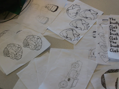
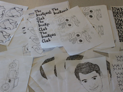
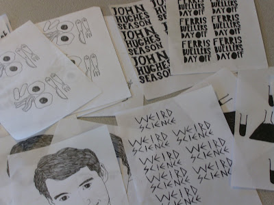
Here is my progression on The Ferris Bueller Ident. I looked at the way Ferris Bueller looked in the stop-motiony bit in the video I put up for my final crit, I realised that potentially the fact that it looked reversed out made him quite unrecognisable, so instead I put it the right way round and used a white outline round his head to seperate him from the red circle.
So here is what I planned pretty much, except I cut the third 'bueller' form the sound file because it was too long, I don't think it takes anything away from it having it just twice, infact a third time would be too repetative.
Here is the standard 'John Hughes Season' text, I'm going to use the same one for every Ident for two reasons; it creates a continuity between the ident and it also saves me alot of time that's becoming an increasingly precious commodity at the moment.
This is just to demonstrate something I need to remember when exporting or I'm going to have some dire looking movies, I forgot to change the render from third to full quality when exporting it.
Here I've added the Film 4 section, I tried to make it move, however, I think that that, combined with the motion of the stop motion just makes it hard to read the text because your eyes are focusing on the lines zipping everywhere.
Here it is, not moving, however I realise that it looks wrong and the lines need to read as a 4, which they don't with the horizontal line going right across the circle.
I asked both my housemates if they could read this as film4, thankfull it passed the test, and here we have a final Ident.
Here is my progression for the Breakfast Club Idents:
t.
Here is my attempt to use that eating motion as a replacement for a fade out or a motion out of the circle. I thought that it was quite a nice clever Idea, however I thought the Molly in a loveheart at the beginning was starting to seem flabby and unneccassary.. I also thought it might be a little confusing, even to those who are familiar with the films, just incase they arn't familiar with John Hughes icon Molly Ringwald.
I initially started trying to use the last lot of storyboards I drew to sort of create a summary of the film almost, but I realised 2 things, firstly that it was incredibly dull to do it this way, and also th epeople who would be interested in this season already know the plots so it's not exactly interesting for them. So I thought a little whle, and using the components I already had, i decided to make a series of pictograms that represent the films, so following on from this video, I began focusing in on the breakfast,a nd using the experiment I did for my final crit with the breakfast being eaten, I thought that would be a nice little image to create a quick, simple and to the point ident.
And Here's how I progressed with weird science:
These are again, like the early breakfast club and sixteen candles videos, attempt summarise the plot points of weird science i.e. science (symbolised by test tube and conicle flas, frankenstein and a bra that symbolises the sexed up nature of the film. On the storyboard it seemed to work but after some progression with ti, I realised that I detested the way Frankenstein's head looked and that the Bra was uneccassary, arriving at a similar sort of Pictogram stage that i did with the other idents. I used an arcade game sound effect to soundtrack the changes in frmes, which ended up being the only thing I liked about the initial videos.
Here I looked at the Icon and the way it could move out of the way for the 'Weird Science' text. I didn't like this one above because it seemed too slow.
I tried using the technique that I'd used at the beginning, having the text shoot on from the bottom of the screen, I thought that it gave it a dynamic kind of feel that seemed appropriate to the film and so I stuck with it.
And here's a quick pr0gression on 16 Candles:
Again, I diligently started putting in all the compoistions I would be using to represent sixteen candles, when it seems kind of redundant and unnecessary to my concept.
I quickly thought about how effective it would be to use the candles as a pictogram for it. Thinking to the way the sounds worked in the Breakfast Club and Weird Science, I was hit by a wave of inspiration and thought that the sound of breath blowing out the candles could be really interesting, unfortunately the sound I got wasn't quite right but it was the only one I could find. I tink it still works effectievly enough and the fading out of the candles sort of eludes to the candle going out slowly.
And from here, my entire plan for the John Hughes Movie Season section changed, after I realised that having symbols summing up plot points looked a little weak, I realised that it was best to have a summary ident one that carries all of the information in the other slides, allowing the viewer to know what every film in the season was, in one showing, here it is:
Initially I started by putting in the components, using the other Idents to inform the layouts, theres no transitions on this one like a fade out etc, which makes it quite difficult to follow because eveyr change is jarring.
I added fade ins and outs because I needed to see whether that would make the animation run smoothly, it was a success and I decided tostick with it because I really enjoyed the way the circles sort of changed colour slowly, over the next few I tried to exaggerate this a little bit more. I chose the Beatles twist and shout as the accompanying music, I was initially going to use Don't you Forget about me, like in The Breakfast Club, however, I decided not to for two reasons, firstly I didn't want to repeat myself, and secondly, I didn't want something that slow, I wanted more of a celbration of the movies. Twist and Shout is from the iconic Parade scene in Ferris Bueller's Day Off. Listening to the song, I though the break down bit was perfect, the way the harmonies increase works beautifully for the visual changes, every time the film changes, the harmony changes and I think it has a nice synchronicity.
It came together pretty quickly and quickly organically, here I've tweaked timings a bit, mainly with the fade ins and outs which youtube has thoughtfully cut off, thinking them unneccassary, as is there want.


Here is my progression on The Ferris Bueller Ident. I looked at the way Ferris Bueller looked in the stop-motiony bit in the video I put up for my final crit, I realised that potentially the fact that it looked reversed out made him quite unrecognisable, so instead I put it the right way round and used a white outline round his head to seperate him from the red circle.
So here is what I planned pretty much, except I cut the third 'bueller' form the sound file because it was too long, I don't think it takes anything away from it having it just twice, infact a third time would be too repetative.
Here is the standard 'John Hughes Season' text, I'm going to use the same one for every Ident for two reasons; it creates a continuity between the ident and it also saves me alot of time that's becoming an increasingly precious commodity at the moment.
This is just to demonstrate something I need to remember when exporting or I'm going to have some dire looking movies, I forgot to change the render from third to full quality when exporting it.
Here I've added the Film 4 section, I tried to make it move, however, I think that that, combined with the motion of the stop motion just makes it hard to read the text because your eyes are focusing on the lines zipping everywhere.
Here it is, not moving, however I realise that it looks wrong and the lines need to read as a 4, which they don't with the horizontal line going right across the circle.
I asked both my housemates if they could read this as film4, thankfull it passed the test, and here we have a final Ident.
Here is my progression for the Breakfast Club Idents:
t.
Here is my attempt to use that eating motion as a replacement for a fade out or a motion out of the circle. I thought that it was quite a nice clever Idea, however I thought the Molly in a loveheart at the beginning was starting to seem flabby and unneccassary.. I also thought it might be a little confusing, even to those who are familiar with the films, just incase they arn't familiar with John Hughes icon Molly Ringwald.
I initially started trying to use the last lot of storyboards I drew to sort of create a summary of the film almost, but I realised 2 things, firstly that it was incredibly dull to do it this way, and also th epeople who would be interested in this season already know the plots so it's not exactly interesting for them. So I thought a little whle, and using the components I already had, i decided to make a series of pictograms that represent the films, so following on from this video, I began focusing in on the breakfast,a nd using the experiment I did for my final crit with the breakfast being eaten, I thought that would be a nice little image to create a quick, simple and to the point ident.
And Here's how I progressed with weird science:
These are again, like the early breakfast club and sixteen candles videos, attempt summarise the plot points of weird science i.e. science (symbolised by test tube and conicle flas, frankenstein and a bra that symbolises the sexed up nature of the film. On the storyboard it seemed to work but after some progression with ti, I realised that I detested the way Frankenstein's head looked and that the Bra was uneccassary, arriving at a similar sort of Pictogram stage that i did with the other idents. I used an arcade game sound effect to soundtrack the changes in frmes, which ended up being the only thing I liked about the initial videos.
Here I looked at the Icon and the way it could move out of the way for the 'Weird Science' text. I didn't like this one above because it seemed too slow.
I tried using the technique that I'd used at the beginning, having the text shoot on from the bottom of the screen, I thought that it gave it a dynamic kind of feel that seemed appropriate to the film and so I stuck with it.
And here's a quick pr0gression on 16 Candles:
Again, I diligently started putting in all the compoistions I would be using to represent sixteen candles, when it seems kind of redundant and unnecessary to my concept.
I quickly thought about how effective it would be to use the candles as a pictogram for it. Thinking to the way the sounds worked in the Breakfast Club and Weird Science, I was hit by a wave of inspiration and thought that the sound of breath blowing out the candles could be really interesting, unfortunately the sound I got wasn't quite right but it was the only one I could find. I tink it still works effectievly enough and the fading out of the candles sort of eludes to the candle going out slowly.
And from here, my entire plan for the John Hughes Movie Season section changed, after I realised that having symbols summing up plot points looked a little weak, I realised that it was best to have a summary ident one that carries all of the information in the other slides, allowing the viewer to know what every film in the season was, in one showing, here it is:
Initially I started by putting in the components, using the other Idents to inform the layouts, theres no transitions on this one like a fade out etc, which makes it quite difficult to follow because eveyr change is jarring.
I added fade ins and outs because I needed to see whether that would make the animation run smoothly, it was a success and I decided tostick with it because I really enjoyed the way the circles sort of changed colour slowly, over the next few I tried to exaggerate this a little bit more. I chose the Beatles twist and shout as the accompanying music, I was initially going to use Don't you Forget about me, like in The Breakfast Club, however, I decided not to for two reasons, firstly I didn't want to repeat myself, and secondly, I didn't want something that slow, I wanted more of a celbration of the movies. Twist and Shout is from the iconic Parade scene in Ferris Bueller's Day Off. Listening to the song, I though the break down bit was perfect, the way the harmonies increase works beautifully for the visual changes, every time the film changes, the harmony changes and I think it has a nice synchronicity.
It came together pretty quickly and quickly organically, here I've tweaked timings a bit, mainly with the fade ins and outs which youtube has thoughtfully cut off, thinking them unneccassary, as is there want.
Saturday, February 6, 2010
Final Storyboards
John Hughes Season Ident:


Sixteen Candles Ident:


Weird Science Storyboard


The Breakfast Club Ident


Sixteen Candles Ident:


Weird Science Storyboard


The Breakfast Club Ident


Wednesday, February 3, 2010
Final Crit
Here's some experiments I've been doing to try and create an ok Ident, I like the simplicity, but I'm really struggling to engage with my ident. The others are at a stage I don't feel particularly comfortable with to show. To be honest, despite a mammoth amount of work, I feel like I've got a project in crisis and I need to pull it back from the brink.
I had to cut it down from what I was planning with my storyboards, severely so my main question is:
Thoughts on how to make it more interesting?
Although it needs work, does it fit my current teen audience?
Does it also look suitably dated and retro to appeal to an 80's audience?
Should I go less hand drawn and more digital?
Monday, February 1, 2010
Urgh, hitting the storyboards again.
Right, so the last idea was good, or so I thought, however below are the audiofiles for the quotes I selected,most of them, with the exception of the 'bueller' quote are way too long for me to be able to put information across that the viewer needs to see as well.
The Breakfast Club I cut this to start from 'each one of us is a...' but even at that point it's too long, even with a qoute below 10 seconds, if it's more than 6, I'll have no time to get the rest of the info in.
If I used the bit that says just 'bueller... bueller... bueller' then it's definitely short enough, so I could probably use this one quite well.
The one for weird science, I wanted to use the one from the storyboards about motorcycles and mutants because i thought the imagery was particularly vivid, however i couldn't find it anywhere, instead I found this one, again, i have the issue that it's too long to make it effective.
Given that most of them with the exception of ferris Bueller went wrong, I had to think of a new plan, so more storyboards were needed:

So above is the new idea for weird science, it plays to the song 'weird science' by oingo boingo because thats the most immediately recognisable song from the film. it basically uses pictograms like the previous storyboard to outline the plot like in the first lot of storyboards but because it does it in a much quicker, much more immediate way, I'll have time to display all the info the viewer needs. I pln to use stop motion to make them shakey and wobbly and a bit retro as outlined in my design context blog.


Here are a few for the John Hughes storyboards, essentially the first ine, I realised I could fit in a bit more infor because theres less info to put out, i.e. i don't have to hold the film title for at least 1 second, because theres no film title in it, so in the second one, i stuck in the musical note as a pictogram for sound. This will play to, 'don't you forget about me' by simple minds, which I think is appropriate given that he died recently.

Because I think the qoute will work effectively for ferris bueller, I decided to keep a similar story board style, with ferris bobbing up and down, however, I decided to keep him inside the circle, the motif i decided to keep on from the first lot of storyboards, this keeps a consistency across the board with all idents, allowing for a clear continuity.


Here are the storyboards for 16 candles, I initially used the girl sign to point out it was about a girl in highschool, however it seemed to me that this might confuse people and say 'ladies toilet' instead. I think cutting it out still allows for people to realise what the film is, pretty much as soon as the candle appears. It'll play to 'happy birthday' by altered image which will give another clue as well.
I really don't have time to dally around now, so I'm going with these ideas, below I've made a list of assets I need so I can draw them out, otherwise I'll get confused and forget to draw things. I'll then scan them in and alter them using illustrator and photoshop.

The Breakfast Club I cut this to start from 'each one of us is a...' but even at that point it's too long, even with a qoute below 10 seconds, if it's more than 6, I'll have no time to get the rest of the info in.
If I used the bit that says just 'bueller... bueller... bueller' then it's definitely short enough, so I could probably use this one quite well.

The one for weird science, I wanted to use the one from the storyboards about motorcycles and mutants because i thought the imagery was particularly vivid, however i couldn't find it anywhere, instead I found this one, again, i have the issue that it's too long to make it effective.

Given that most of them with the exception of ferris Bueller went wrong, I had to think of a new plan, so more storyboards were needed:

So above is the new idea for weird science, it plays to the song 'weird science' by oingo boingo because thats the most immediately recognisable song from the film. it basically uses pictograms like the previous storyboard to outline the plot like in the first lot of storyboards but because it does it in a much quicker, much more immediate way, I'll have time to display all the info the viewer needs. I pln to use stop motion to make them shakey and wobbly and a bit retro as outlined in my design context blog.


Here are a few for the John Hughes storyboards, essentially the first ine, I realised I could fit in a bit more infor because theres less info to put out, i.e. i don't have to hold the film title for at least 1 second, because theres no film title in it, so in the second one, i stuck in the musical note as a pictogram for sound. This will play to, 'don't you forget about me' by simple minds, which I think is appropriate given that he died recently.

Because I think the qoute will work effectively for ferris bueller, I decided to keep a similar story board style, with ferris bobbing up and down, however, I decided to keep him inside the circle, the motif i decided to keep on from the first lot of storyboards, this keeps a consistency across the board with all idents, allowing for a clear continuity.


Here are the storyboards for 16 candles, I initially used the girl sign to point out it was about a girl in highschool, however it seemed to me that this might confuse people and say 'ladies toilet' instead. I think cutting it out still allows for people to realise what the film is, pretty much as soon as the candle appears. It'll play to 'happy birthday' by altered image which will give another clue as well.
I really don't have time to dally around now, so I'm going with these ideas, below I've made a list of assets I need so I can draw them out, otherwise I'll get confused and forget to draw things. I'll then scan them in and alter them using illustrator and photoshop.

Thursday, January 28, 2010
My own attempts at hand drawn fonts.
Below are some attempts to create my own type, I'm not happy with all of them but I'll go through it anyway:

None of these John Hughes fonts strike mutch of a chord with me, I think I need to draw from the font research I did on my context blog a bit more.

I actually really like the counter-less font on the far right bottom. I like it's layout and it has a similar fun vibe to the research I did on my context blog.

I experimented with the angular style and I quite like it, though I think it needs to be thicker to stand out in the circular setting it'll have.

I tried to do script fonts, but they don't seem as beautiful or ornate as the font I picked out over on the context blog. I think I need to work on it a bit and make it a bit thicker and bigger, allowing for some detail on it.
Finally, I need to look at the breakfast club, The font I've used in the storyboards is just my handwriting and to be honest, I think it's a bit naff and too uneven and scrawly, so I'll try something different on that and keep you posted.

None of these John Hughes fonts strike mutch of a chord with me, I think I need to draw from the font research I did on my context blog a bit more.

I actually really like the counter-less font on the far right bottom. I like it's layout and it has a similar fun vibe to the research I did on my context blog.

I experimented with the angular style and I quite like it, though I think it needs to be thicker to stand out in the circular setting it'll have.

I tried to do script fonts, but they don't seem as beautiful or ornate as the font I picked out over on the context blog. I think I need to work on it a bit and make it a bit thicker and bigger, allowing for some detail on it.
Finally, I need to look at the breakfast club, The font I've used in the storyboards is just my handwriting and to be honest, I think it's a bit naff and too uneven and scrawly, so I'll try something different on that and keep you posted.
New Storyboards.
Ok, so after realising that the last storyboards were too long and wouldn't possibly condense to 10 seconds, I decided to look at what I could do instead, from my initial research, I realised that things that people picked up on were quotes, so i decided that looking at dialogue would probably be a good idea. Memorable quotes from the movie are likely to inspire nostalgia and humour. I decided that it would probably best to animate this with pictograms rather than words, so here are a few storyboards looking at that.

In the case of hte breakfast club, theres two frames I had to add to fill out the qoute, they're donw the side, theyre images fo a crown to represent the princess qoute and a burglers mask and hat to represent the word criminal.


As you can see, they all use very simple images to represent key words in the qoute and the images will change as the qoute progresses, or in the case of ferris bueller, it'll say 'bueller' and his head will bob up and then down as if he's hiding, which I think will provide some humour and reiterate the films narrative of a boy playing truant.

In the case of hte breakfast club, theres two frames I had to add to fill out the qoute, they're donw the side, theyre images fo a crown to represent the princess qoute and a burglers mask and hat to represent the word criminal.


As you can see, they all use very simple images to represent key words in the qoute and the images will change as the qoute progresses, or in the case of ferris bueller, it'll say 'bueller' and his head will bob up and then down as if he's hiding, which I think will provide some humour and reiterate the films narrative of a boy playing truant.
Wednesday, January 27, 2010
Storyboards an Progress evaluation

Ok so this is my full storyboard in detail using what at the time, I thought would be some of the final compositions for the actual animation. However I think it's important at this stage to really re-evaluate what I've done. Firstly, as I was writing notes of what motions where on this, I realised that this was going to take a ridiculously long time ot bring to fruition (for one ident, let alone 5!), I attribute this to it being too complicated. I also think that something this intricate is unlikely to fit within 10 seconds.
Another point I'm beginning to struggle with, is how does this answer my brief, does it speak to both my audiences in a way that would appeal to them? personally, I don't think it does, it seems a bit obvious, not very humerous, though it does demonstrate some content from the movie, i can't help but feel people would switch off.
I talked to other members of the group about this as I was beginning to panic that I was going to have to scrap everything, however I was asked whether I could just strip it down but retain some of the elements I had been using, to this extent, I'm going to lose the idea of following a path around because that's one extra issue I don't want to have to deal with. With that in mind I need to develop an action plan to be getting to the stage of making animations as quickly as possible:
Thursday 28th Jan: -Finish Storyboarding new ideas
-have visual aesthetic fully realised
Monday 1st Feb: -have at least one composition animated.
Wednesday 3rd feb: -have atleast 3 videos at a stage where people in a crit can get a sens of what's going on.
Working with other Idents.
So this is just some images of me trying to appropriate the style from the last ident to the other films, I've attempted to do this by drawing from shapes and movements I want from the last Ident but using colour and imagery to create a unique identity for each one.
The ones below are me searching for a colour that goes with John Hughes, I liked the yellow, but at the crit last week, the yellow's visibility was called into question. On reflection, the mustard i started with is possibly the one to go for. I got the John Hughes picture by extracting it from a very popular photography portrait of him, i think theres something iconic about it.


Below is me working my way through the imagery for 16 candles, I've tried variations of pink because i think it's the most appropriate colour to represent a girl orientated teen comedy. I selected the image from the film poster/DVD cover of the time because it will have a familiarity with the audience from the 80's and shows recognizable characters from the movies that a modern audience would understand.

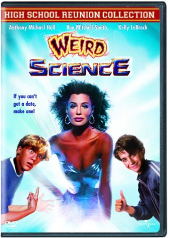
For weird science, I though that a green would be apropriate so her I've just explored a few different greens, I like it muted becase it sort of matches the muted blues and pinks from the other idents. The typography is a variation on the typography from the DVD cover

All being well, if the detailed storyboarding of 'The Breakfast Club' ident works, then I can start developing this imagery.
The ones below are me searching for a colour that goes with John Hughes, I liked the yellow, but at the crit last week, the yellow's visibility was called into question. On reflection, the mustard i started with is possibly the one to go for. I got the John Hughes picture by extracting it from a very popular photography portrait of him, i think theres something iconic about it.


Below is me working my way through the imagery for 16 candles, I've tried variations of pink because i think it's the most appropriate colour to represent a girl orientated teen comedy. I selected the image from the film poster/DVD cover of the time because it will have a familiarity with the audience from the 80's and shows recognizable characters from the movies that a modern audience would understand.

For weird science, I though that a green would be apropriate so her I've just explored a few different greens, I like it muted becase it sort of matches the muted blues and pinks from the other idents. The typography is a variation on the typography from the DVD cover

All being well, if the detailed storyboarding of 'The Breakfast Club' ident works, then I can start developing this imagery.
Development of other frames for BREAKFAST CLUB IDENT
I looked at developing these quite fully, so I can make a detailed storyboard that demonstrates how I want things to move. Here are the results:
First we have the opening frame that sort of demonstrates molly ringwald, There's a progression of me making the composition up. I sort of knew what elements I wanted to bring to it and then messed around with them as I went along, I like that the blue circle that's in the title section crops up again, I think it'll give the animation a nice continuity.


I've done similar for the other frames that I'll upload, I'm starting to doubt that this is the way forward because it's so time consuming.
Right, here are the frame developments for the detention section as outlined in the post-it development earlier. I've tried a few things out with this one, but I'm still not happy with it, however I decided to go with one for the storyboard just so I have a rough sequence of events in my head and a reasonably detailed map down on paper:


I started looking at the idea of lockers, representing school, the lockers feature quite heavily as imagery in the breakfast club. However, this by it's self didn't represent detention very well to my mind, I then introduced the hand because I thought about the hand of authority etc. and how significant that could be in demonstrating it. I spent a while working with this and then working the locker back into it, however it wasn't very satisfactory. I also had the idea that a path runs down to spell detention and draws the guy at his desk, which might still work, however I don't like the aesthetic of my idea. As I say, I'm not satisfied with this composition at all. My last idea on that section was to have the circle that seems to be a recurring theme become a clock that ticks but doesn't move past the same point, giving the idea of endless time that traditionally is associated with detention.
Finally, before we get to the title frames, there is the breakfast/no breakfast joke:


 I kind of new what I wanted with this one rather than with the detention frame where I kind of muddled through the ideas. I mainly just experimented with scale to begin with.
First we have the opening frame that sort of demonstrates molly ringwald, There's a progression of me making the composition up. I sort of knew what elements I wanted to bring to it and then messed around with them as I went along, I like that the blue circle that's in the title section crops up again, I think it'll give the animation a nice continuity.


I've done similar for the other frames that I'll upload, I'm starting to doubt that this is the way forward because it's so time consuming.
Right, here are the frame developments for the detention section as outlined in the post-it development earlier. I've tried a few things out with this one, but I'm still not happy with it, however I decided to go with one for the storyboard just so I have a rough sequence of events in my head and a reasonably detailed map down on paper:


I started looking at the idea of lockers, representing school, the lockers feature quite heavily as imagery in the breakfast club. However, this by it's self didn't represent detention very well to my mind, I then introduced the hand because I thought about the hand of authority etc. and how significant that could be in demonstrating it. I spent a while working with this and then working the locker back into it, however it wasn't very satisfactory. I also had the idea that a path runs down to spell detention and draws the guy at his desk, which might still work, however I don't like the aesthetic of my idea. As I say, I'm not satisfied with this composition at all. My last idea on that section was to have the circle that seems to be a recurring theme become a clock that ticks but doesn't move past the same point, giving the idea of endless time that traditionally is associated with detention.
Finally, before we get to the title frames, there is the breakfast/no breakfast joke:


 I kind of new what I wanted with this one rather than with the detention frame where I kind of muddled through the ideas. I mainly just experimented with scale to begin with.
Subscribe to:
Posts (Atom)