Showing posts with label Membership pack. Show all posts

Monday, December 6, 2010

Rule and regulation book covers

Order of The Magi


I exported these images for the order of the magi book cover form illustrator because I'm an idiot and forgot about the bounding box issue, so the images above are absolutely redundent, other than to demonstrate that despite you not being able to tell how they're different, there is a numerical value to the amount of things I tired out. It's disappointing and I just don't have the energy this close to the deadline to re-document it. It's my fault and if I lose marks for this then on my head be it.


The UK guild of Taxidermists


With the guild of Taxidermists book cover for their rules and regulations, it was essentially creating type in the same style as the membership card and finding where it sits best amongst the tools. I tried a few things but it seemed to look awkward on the page evrywhere except the bottom, where it seemed to sit quite nicely, and that is where it will stay.


Flat Earth Society:


The rules and regulations booklet cover initially used the flat earth model diagram that I'd designed, but this was just didn't seem to work as well as I'd of liked it to, and also I wanted to tie it to the membership card more closely, so I went with those colour choices. The type for the cover is Adobe Caslon Pro, which I used for the typography on the logo in the end.

Sunday, December 5, 2010

Guild Of Taxidermists Certificate Design

Here's some things I tried out for the Guild of Taxidermists certificate layout, again, I used the things that I'd been working on before (membership card, general identity) again to inform the design direction of the certificate. I initially started using the exact colour scheme I'd been using before, with the browny-cream colour and the dark red, but it seemed to heavy for the simple typographic solution, so I came up with the idea of using white and red for the type side and double siding it with the brown and red tools on the other side. Unfortunately, I left the membership card in the corner to refer back to, and exporting it as a jpeg has meant that this has appeared throughout, also for some reason it's removed the bounding box. This is a bit of a problem so I'm going to try and ensure I don't make this stupid mistake again.


The design of the layout seems to be working best when the body of the certificate takes up the same width as the very wide logo, rather than very centrally aligned quite narrowly. I like the cleaness and simplicity of the certificate against the white, and having the backing will mean that it still ties in together with the rest of the identity for the membership pack.


Back of the certificate design:

Saturday, December 4, 2010

Order Of the Magi Membership Cards


Here's some development for the membership card. Simplicity seems to be the key with trying to create an aura around your symbol, so I've tried to make it as clean as possible, experimenting with different fonts before deciding on futura, tracked 240 to create a very spacious and minimalist feel to the card.

I'm thinking of a special finish for this, but I realise there probably won't be enough time (especially with the large amount of print process I've only just managed to complete on my 'cults brief'. So I'm tempted to either mock up fluorescent yellow or a metallic gold finish for the boards, the finish, especially if it's metallic gold would emphasise the prestige of a long running 'order'.

Flat Earth Society Membership Cards

From the logo I developed, here is the progress of my membership card, I worked quite quickly on this, because I'm aware that I'm beginning to run out of time. I tried to bring in the flat earth model vector that I'd tried to encorporate directly into the logo, but it still wasn't working in this context, so I'm looking at trying to make it work in other elements as a more subtle part of the societie's identity. Looking at the colourways that I've explored, I got some people's feedback, I was trying to explore earthy colours of blues, greens and greys/browns. All very muted. I asked 5 people and the answer was almost universally the greyish colour. I thought this one seemed to work most effectively too, so this is the direction I'm going to go in with it.

Guild Of Taxidermists Membership Cards

Here's a few proposals for the way the membership card should work, exploring both double sided and a single sided card. I looked at the two vector based directions and how they could be employed. I looked at laying out the tools around the words as a central focus to make the membership card fit in with the general direction that I want to head with this. I would rather do a single sided card, because I think it works just as well as double sided, and it would be much cheaper, both for me to manufacture for the sake of this project, and for the guild to manufacture as a whole.


I then put it through a variety of different colour ways, I wanted to look at a sort ofoff white/cream coloured background to make it feel a bit more vintage and feed into the Victorian element of the tool-based craft design. The website uses a colour scheme of dark red and a cream colour, so I figured that this might be a nice way to tie the design in with what they already have. Though, I do quite like the way the turquoise looks aginst the dark cream colour as well. For now I'm going to carry the dark red through though, but (when I can get into the print room, it's rammed) I will print the colourways and ask a few people's opinions.

Friday, December 3, 2010

Different directions Guild of Taxidermists


Leading on from the very vector lead imagery of the last direction, I took that style and applied it to some mounted horns that symbolise the end result of the trade. I think this is a little more twee than the other direction and doesn't have as much significance, though it maybe symbolises more to the outside world than the last direction. However, this is a membership pack directed squarely at taxidermists and taxidermy collectors who will know about the process, so I'm not as worried about it.


I then tried this photographic direction, creating a half tone to make the image big enough to apply across a range of formats. I don't think that this is right tonally, it seems very current and very youthful, but probably doesn't speak to my target audience in any real and meaningful way. I see the tools idea I had in the last post as having the most legs, so I'm going to apply this to the range of products I need in my membership pack: Certifcate, membership card, welcome letter and a book of rules and regulations, as well as an envelope to hold them all together.

UK Guild of Taxidermists

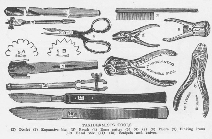
OK so i googled Taxidermy to try and get some interesting visuals and immedietely the following images of all their tools came up, I thought this was a unique way to go, and considering that my audience is going to be taxidermists already, there isn't really a reason to have to explain what these tools are, they can just sit there as signifiers of the taxidermist's craft and be instantly recognised by them.


I immediately thought that turning these into a series of intricate vectors that are laid out well could create a very unique and interesting identity for them. SO I set about tracing the mot interesting of them, I left a few out because they were very similar to other tools I'd already done, or they didn't lend themselves well to becoming a vector. I played around with a few different typographic approaches and had Craig on hand to give me a few different ideas about typographic approaches, I looked at condensed fonts and deco style fonts because they always spring to mind with these very simplistic almost screen print style 2 colour imagery. Something wasn't working about them, so I looked at goigng the other way, with a very thin weighted font, with a very large leading, so I looked at Gill Sans light at a leading of almost 300, using lines above and below the word taxidermist to anchor the widely tracked lettering together, without it looking too sparse and disparate.


I looked a little bit at colourways but I obviously need to explore this further, but this gives me one really strong direction I can go in, because it says craft and skill, it speaks directly to my audience who have a special understanding of taxidermy tools and it's a lot more inventive than what they seem to have: http://www.taxidermy.org.uk/

Anyway, on with more design directions.

Friday, November 26, 2010

Further development Flat Earth logo


Ok, so not satisfied entirely with where I was going, I looked at a different approach to the logo using a flat circle to represent the disk model that Flat Earthers believe exists, using flat horizontal lines to intersect the type to emphasise this, but I'm not really sure of the clarity of it to be perfectly honest. I do enjoy the different weightings in the logo to put emphasis on the flat earth section though, so this is something that I can perhaps take forward with it.


I started to look back at where I was going with it before, sort of modelling this kind of victorian adventurer style that seemed to be developing. Ian linked me to this website for 826 DC's unnatural history museum and the style of logo has elements that I really enjoyed and really suited the direction this particular branding was going in. I tried to keep the flat earth model vectors I was working with before, but it wasn't gelling, so I'm going to try and work it in as a texture for the inside of the regulations book cover, membership cards etc.

The one that I'm thinking is working most effectively is the top one in the row at the far right. The est. 1956 is too close to the rest of the logo when placed either side of 'The' and causes hierarchy issues, where as, when placed over the border art, it sinks back and lets the flat earth society come to the foreground. The type is a combination of Bebas, which reminded me of the unnatural history museum logo, and adobe Caslon, initially I went with Baskerville and all capitals, but the difference in line weight across the letterforms in Caslon makes it that bit more interesting to me, it also plays of the very flat and blocky bebas quite nicely.

Monday, November 22, 2010

Further development and colourways

From the logos I handed out, I then decided to explore that one even further in it's layout and then look a little at colourways:


Again. I'm not sure about which one I prefer, so I'm going to have to print a load of these off and ask people to give me opinions. I'm leaning towards earthy colours (obvious reasons) like the terracotta, greens, blues and browns.