
Monday, December 13, 2010
ISTD Fakery Brief
Because obviously time is running out and I still want to do this brief, I've rewritten it to have a 24 hour time limit to produce a printed resolution and a digital resolution. Whatever I get done in that day is the final outcome, this will give me something to springboard off of if I want to continue this as an expanded brief in the next module. Here is the brief to accompany the official ISTD brief:

Wednesday, December 8, 2010
Rules and Regulations book, Order of The Magi
This booklet was easier than the other too, I'd decided to use a similar layout throughout the rules and regulations booklets so it was a case of substituting appropriate content fonts and logos.


Similarly to the other two books, I decided to have the opening page devoted to the motto of the society or at least a positive set of phrases that represent the society well, for example, the quote here isn't from an actual motto, but a nice little phrase at the end of their about us section, which carried the mystery and ambiguity about magicianship that made them as a group seem really interesting.


The layout and grid is the same as the others, a key difference is the presence of the logo on each individual page, This was done because it created balance in a similar way to the tools on the guild of taxidermy page and the little floral decorative pieces on the flat earth society booklet.

Tuesday, December 7, 2010
Rules and Regulations book, flat earth society
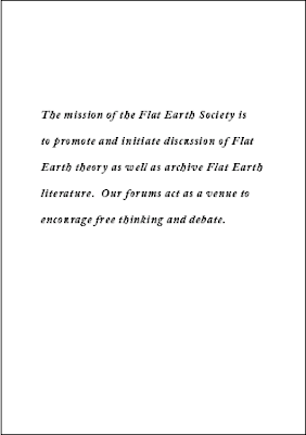
I started trying to lay out the motto of the flat earth society as a nice introduction to the society and the way it works. I experimented with a few layouts using both bebas and adobe caslon from the logo before deciding that Caslon looked the most appealing of the two.


Here is the grid I used, consisting of 6 columns and 8 rows both with a gutter of 4.33 mm


I started with the contents and the FAQs on the same spread, but I realised this looked to cramped and i had space to spare so I laid them out on separate more spacious spreads.


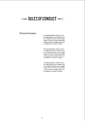
I picked the six column grid mainly for the way it would make the rules and regulations spread look, with the section and then the rules lying in separate sets 2 columns wide.


After laying out those previous spreads above, I looked at the contents page and decided that it looked a bit empty, this was the perfect place to put the logo in to make the pages parallel and create a balanced looking spread.


I then decided that the ornamental pieces found under the word member in the membership cards would stop the spreads from looking quite so bland and began adding them as a divider between title and content. I think it works pretty welll, they don't seem to detract from any of the content at all, or interfere with the hierarchy.


Here is the grid I used, consisting of 6 columns and 8 rows both with a gutter of 4.33 mm


I started with the contents and the FAQs on the same spread, but I realised this looked to cramped and i had space to spare so I laid them out on separate more spacious spreads.


I picked the six column grid mainly for the way it would make the rules and regulations spread look, with the section and then the rules lying in separate sets 2 columns wide.


After laying out those previous spreads above, I looked at the contents page and decided that it looked a bit empty, this was the perfect place to put the logo in to make the pages parallel and create a balanced looking spread.


I then decided that the ornamental pieces found under the word member in the membership cards would stop the spreads from looking quite so bland and began adding them as a divider between title and content. I think it works pretty welll, they don't seem to detract from any of the content at all, or interfere with the hierarchy.


Guild Of taxidermists rules and regulations book


Here's some of the development work for my layouts for the rules and regulations book, I didn't really record this as well as I could have done, it seems that all the systems I had in place quite early on in the project seem to have gone out the window as I rush madly to get everything done. This isn't ideal but I guess I'll learn from it. I'm pretty sure next time I will spend 3-4 days before I even begin designing at the start of the brief putting in very thorough and methodical timeplanning procedures etc. Anyway a lot of decisions with the book are informed by the rest of the things I've done, the font is Gill Sans book to have it run alongside the logo well. I put the tools into the design because I wanted to add a bit of interest because the pages were looking a little bland by themselves. I added the line dividers into the layout to create seperation in the sections and add a bit of an interesting dynamic. I worked usin a 6 column grid because I wanted to create a bit of a border around the page layout to allow the type to breathe in quite a minimal setting.
Subscribe to:
Posts (Atom)