Saturday, January 30, 2010

Final Fonts

Here are the final fonts I'm going to use looking at a progression from the last post to ones more inspired by the fonts I looked at on my design practice blog.


Thursday, January 28, 2010

My own attempts at hand drawn fonts.

Below are some attempts to create my own type, I'm not happy with all of them but I'll go through it anyway:

None of these John Hughes fonts strike mutch of a chord with me, I think I need to draw from the font research I did on my context blog a bit more.

I actually really like the counter-less font on the far right bottom. I like it's layout and it has a similar fun vibe to the research I did on my context blog.

I experimented with the angular style and I quite like it, though I think it needs to be thicker to stand out in the circular setting it'll have.

I tried to do script fonts, but they don't seem as beautiful or ornate as the font I picked out over on the context blog. I think I need to work on it a bit and make it a bit thicker and bigger, allowing for some detail on it.

Finally, I need to look at the breakfast club, The font I've used in the storyboards is just my handwriting and to be honest, I think it's a bit naff and too uneven and scrawly, so I'll try something different on that and keep you posted.

New Storyboards.

Ok, so after realising that the last storyboards were too long and wouldn't possibly condense to 10 seconds, I decided to look at what I could do instead, from my initial research, I realised that things that people picked up on were quotes, so i decided that looking at dialogue would probably be a good idea. Memorable quotes from the movie are likely to inspire nostalgia and humour. I decided that it would probably best to animate this with pictograms rather than words, so here are a few storyboards looking at that.

In the case of hte breakfast club, theres two frames I had to add to fill out the qoute, they're donw the side, theyre images fo a crown to represent the princess qoute and a burglers mask and hat to represent the word criminal.


As you can see, they all use very simple images to represent key words in the qoute and the images will change as the qoute progresses, or in the case of ferris bueller, it'll say 'bueller' and his head will bob up and then down as if he's hiding, which I think will provide some humour and reiterate the films narrative of a boy playing truant.

Wednesday, January 27, 2010

Type as image, pt III; The Cat Doesn't Speak.

Ok so I started out picking, 'I am either angry, firghtened or drunk.' However, I felt completely uninspired doing this and failed to come up with a single idea that seemed worthwhile. This post deals with the development of my final resolution only. I decided to use helvetica neue with the weight wacked up a bit to give it some meat as a basis for the font.


Right initially, with this idea, I thought about how the article it's self is humorous whilst remaining kind of 'proper' and middle class, which is why I based it so heavily in a traditional looking font as a pose to the quite hand drawn fonts I've used in the other two. I decided that contrasting the straight-laced nature of the font with it's new furry exterior would be a nice juxtaposition that would kind of give a similar sense of humour as the article.


I initially decided to place it in a speech bubble to go along with the 'doesn't speak bit' however, I think that it looked bloody terrible. The shape doesn't and will never lend it's self to the format, I then decided that this part was kind of unneccassary anyway and that I should let the type speak for it's self.

I tried variances on brown and orange to simulate traditional cat colours. Te orange as a background colour is too bright.


At this point i'm split between orange on white and white on brown. I asked Ollie and Tom and they both liked white on brown the best, so this is what I shal print tommorrow.

Storyboards an Progress evaluation


Ok so this is my full storyboard in detail using what at the time, I thought would be some of the final compositions for the actual animation. However I think it's important at this stage to really re-evaluate what I've done. Firstly, as I was writing notes of what motions where on this, I realised that this was going to take a ridiculously long time ot bring to fruition (for one ident, let alone 5!), I attribute this to it being too complicated. I also think that something this intricate is unlikely to fit within 10 seconds.

Another point I'm beginning to struggle with, is how does this answer my brief, does it speak to both my audiences in a way that would appeal to them? personally, I don't think it does, it seems a bit obvious, not very humerous, though it does demonstrate some content from the movie, i can't help but feel people would switch off.

I talked to other members of the group about this as I was beginning to panic that I was going to have to scrap everything, however I was asked whether I could just strip it down but retain some of the elements I had been using, to this extent, I'm going to lose the idea of following a path around because that's one extra issue I don't want to have to deal with. With that in mind I need to develop an action plan to be getting to the stage of making animations as quickly as possible:

Thursday 28th Jan: -Finish Storyboarding new ideas
-have visual aesthetic fully realised

Monday 1st Feb: -have at least one composition animated.

Wednesday 3rd feb: -have atleast 3 videos at a stage where people in a crit can get a sens of what's going on.

Working with other Idents.

So this is just some images of me trying to appropriate the style from the last ident to the other films, I've attempted to do this by drawing from shapes and movements I want from the last Ident but using colour and imagery to create a unique identity for each one.
The ones below are me searching for a colour that goes with John Hughes, I liked the yellow, but at the crit last week, the yellow's visibility was called into question. On reflection, the mustard i started with is possibly the one to go for. I got the John Hughes picture by extracting it from a very popular photography portrait of him, i think theres something iconic about it.


Below is me working my way through the imagery for 16 candles, I've tried variations of pink because i think it's the most appropriate colour to represent a girl orientated teen comedy. I selected the image from the film poster/DVD cover of the time because it will have a familiarity with the audience from the 80's and shows recognizable characters from the movies that a modern audience would understand.


For weird science, I though that a green would be apropriate so her I've just explored a few different greens, I like it muted becase it sort of matches the muted blues and pinks from the other idents. The typography is a variation on the typography from the DVD cover


All being well, if the detailed storyboarding of 'The Breakfast Club' ident works, then I can start developing this imagery.

Development of other frames for BREAKFAST CLUB IDENT

I looked at developing these quite fully, so I can make a detailed storyboard that demonstrates how I want things to move. Here are the results:
First we have the opening frame that sort of demonstrates molly ringwald, There's a progression of me making the composition up. I sort of knew what elements I wanted to bring to it and then messed around with them as I went along, I like that the blue circle that's in the title section crops up again, I think it'll give the animation a nice continuity.


I've done similar for the other frames that I'll upload, I'm starting to doubt that this is the way forward because it's so time consuming.

Right, here are the frame developments for the detention section as outlined in the post-it development earlier. I've tried a few things out with this one, but I'm still not happy with it, however I decided to go with one for the storyboard just so I have a rough sequence of events in my head and a reasonably detailed map down on paper:


I started looking at the idea of lockers, representing school, the lockers feature quite heavily as imagery in the breakfast club. However, this by it's self didn't represent detention very well to my mind, I then introduced the hand because I thought about the hand of authority etc. and how significant that could be in demonstrating it. I spent a while working with this and then working the locker back into it, however it wasn't very satisfactory. I also had the idea that a path runs down to spell detention and draws the guy at his desk, which might still work, however I don't like the aesthetic of my idea. As I say, I'm not satisfied with this composition at all. My last idea on that section was to have the circle that seems to be a recurring theme become a clock that ticks but doesn't move past the same point, giving the idea of endless time that traditionally is associated with detention.

Finally, before we get to the title frames, there is the breakfast/no breakfast joke:


I kind of new what I wanted with this one rather than with the detention frame where I kind of muddled through the ideas. I mainly just experimented with scale to begin with.

Tuesday, January 26, 2010

IMAGE: type as image. pt II; Humans Are Terrible

Ok so here are photos from a shoot I did for the qoute 'humans are terrible.' It's based upon some sketches I did looking at the idea that the article deals with the profound inability for humans to function appropriately with large numbers, it kind of had a sad qaulity to it when it was described that humans would give the same pitiful amount of money to save 200, 2,000 and 20,000 birds, I kind of played on this and showed a sort of profoundness to how bad humans can be by using the eyeliner to suggest the words have been cried out, this again relates to the article section on global warming, where we can't compute how our tiny actions have implications for the rest of the human race.


I think the first of these was the best framed, so I used that, changed the contrast and blew it up to A1 size, results below:


I'm really pleased with the result, I hope it prints ok.

IMAGE: type as image.

This is concerned with the quote 'Everyone you know is your friend" which was from the relationship maths article, I've decided to play upon the sarcasm and wittiness of the article, as well as it's cruelty to create an irony between what the words say and what they mean, essentially 'your a loser'. To this end, I wanted to make the words look as lonely as possible. Part of the brief was to use an existing font, which I did, even though it isn't immediatly obvious. I wanted to use something very hand drawn that kind of makes it seem more personal. I experimented with two type faces, though I stuck with one for the majority as I much prefered it. The one I used for the majority of the development work was: 
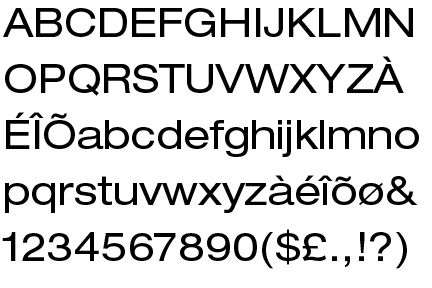
The hand written bit's of Micheal Sieben's work are a real inspiration to me at the moment, I sort of changed the E's so the upper and middle arms were close together instead of the lower and middle. I think that it works. The other was based on simple handwriting fonts:


As you can see, I tried out a few different layouts and colour choices to see if they would work, I relaised that adding the 'hair' imagery was a little to close to breaching the brief, so I then tried to stick to simple circles after that, but I didn't like the additions of those, I ended up sticking with my first design which kind of shows isolation better by not having anything there then by seperating it away from other shapes. I like it in the bottom corner, because it looks more lonesome then when I tried it slap bang in the middle.

-

-

-

-

-
-
-

-

-

-

-
-
-


Although I intend to go back to the original pain image, I do like the one with the words friend?, however I also think this in breach of the brief, so I'm going to ask Amber tommorrow, exactly what i can get away with.