Tuesday, November 30, 2010

Monday, November 29, 2010

Printing Disaster

Ok so recently I took my files for the cults brief to print with James, ready to screen print the special finishes. I took a few different paper stocks, mainly those purchased form the library, there are photos, which I need to find or retake of the different ones, but I also used the matt stock that James had in his printer. Looking at the way they all took the ink, I concluded that the best choice would be to use the matt stock that James had because the ink sat on it and had a much stronger presence, rather than bleeding into the paper, which reduced the clarity of colour, something that was appropriate for the conspiracy theory book, but something I didn't want to emulate with this, I wanted to really show off the print processes. Below are some photos of the screen printing proccess and why I have to do some of them again.


Here's the fluorescent ink on 'antique' paper form the library, as you can see, it's not very bright and the paper has absorbed a lot of that away, which is why I decided to go with the matte stock.


The fluorescent yellow has come out extremely faint, so next time i.e. today, I'm going to make sure I get more pulls thorugh, I've checked and the flat beds still aren't available so I'm going to have to do my best and photoshop them if neccassary.


As you can see the metallic ink has come out patchy, I think theres a few things to blame for this; 1. I had to use the cloth beds instead of the flat beds because they were in use so much. 2.The screen was kind of grainy, an unfortunate side effect of short exposure due to trace paper print outs, and 3. I'm a terrible screen printer. Also note how uneven the fluorescent pink is on the right hand side, another thing I may have to correct.


Here's the result of foil blocking, uneven on one side and the paper beneath it has stuck to the paper on the other side, so utter disaster that I need to do something about today. I decided that to get best results to avoid the unpredictable foil blocking and instead screen print a rich black onto the poster, followed by a heavy spot varnish coat to simulate a similar effect to what I'd get with this.

Sunday, November 28, 2010

A note on the raelian church

So a quick note, I've decided not to print the raelian church piece with glow in the dark in, I'm running out of the amount of time I'm willing to spend on this project and getting hold of the ink is going to be too difficult. Instead this is just a proposal for further pieces that could potentially be added to the series as it goes on.

Order of the Magi logo development


OK above is a few images of the progression I made whilst making the logo for the order of the magi, I started with the principle that it needed to be mysterious and symbolic, representing the mystique and secrecy that surrounds magicians and magic societies in general. I initially started with the shapes in the top left of the first image, which are a traditional symbol for alchemy, but it seemed very bland and communicated geometric shapes than it did mysteriousness. Also the type I'd started working out for it was very flat. I was kind of inspired by some research that I'd already done on Aleister Crowley, who started an order called the A.'.A.'., the way this type looks just written down inspired me to start using the O from order and the M from Magi to start creating a logoform that created more intrigue than just spelling out exactly what it was.
I experimented with using different shapes to turn it into a unique symbol, but ultimately I decided that the O and the underscored M by themselves in the hand worked the most effectively, providing something mysterious but thankfully lacking in gimmick, which was the danger with some of the other ones. I also looked at colourways because I had some idea that I might want to use a fluorescent or a metallic ink on the logo, but I'm not sure yet, I'm running out of time and I still have the cults brief to finish and photograph.

Saturday, November 27, 2010

Development of Press release

Here are the developments for a quick mock up for how Daisy's press release might work. They're based in the minimalism of the stationary she has and the typographic choices relate back to that.


I changed the cover to better suit the stationary by having a white cover rather than a reversed out cover:

And here's the content of the press release mock up:

Friday, November 26, 2010

Rewriting The brief to accomodate myself and Daisy

So, me and Daisy had a discussion recently where the increasing pressure of our projects came up. She is unable to supply me with some of the information I need for the press booklet in time for it to become a full document. I have decided that instead of doing a full press release, it's perhaps best to do proposed layouts and work with the information she can get hold of, with a view to do this booklet properly early in the new year. I also discussed the t-shirt designs, she said theres nothing she can do with them until the new year, so I've decided that it's best to leave that part of the brief until the new year also, for the sake of reducing time on it and increasing time to spend on my other projects. Here is my altered brief:

Further development Flat Earth logo


Ok, so not satisfied entirely with where I was going, I looked at a different approach to the logo using a flat circle to represent the disk model that Flat Earthers believe exists, using flat horizontal lines to intersect the type to emphasise this, but I'm not really sure of the clarity of it to be perfectly honest. I do enjoy the different weightings in the logo to put emphasis on the flat earth section though, so this is something that I can perhaps take forward with it.


I started to look back at where I was going with it before, sort of modelling this kind of victorian adventurer style that seemed to be developing. Ian linked me to this website for 826 DC's unnatural history museum and the style of logo has elements that I really enjoyed and really suited the direction this particular branding was going in. I tried to keep the flat earth model vectors I was working with before, but it wasn't gelling, so I'm going to try and work it in as a texture for the inside of the regulations book cover, membership cards etc.

The one that I'm thinking is working most effectively is the top one in the row at the far right. The est. 1956 is too close to the rest of the logo when placed either side of 'The' and causes hierarchy issues, where as, when placed over the border art, it sinks back and lets the flat earth society come to the foreground. The type is a combination of Bebas, which reminded me of the unnatural history museum logo, and adobe Caslon, initially I went with Baskerville and all capitals, but the difference in line weight across the letterforms in Caslon makes it that bit more interesting to me, it also plays of the very flat and blocky bebas quite nicely.

Wednesday, November 24, 2010

DSW publication

OK, so part of the brief called for a press release/portfolio of work that could be given out and mailed out to potential clients and even employers if she decides to become a designer for someone else's company. I did some quick paper mock ups of the forms that it could take, be it a fold out poster or a standard booklet.

So my first idea was to do a fold out poster with a splash page on one side and then the other information laid out on the other side in an interesting and well gridded way. Unfortunately the image quality of even the good photos that Daisy has sent mean that they're too small to make a full page spread with, eliminating this as an option.


The second format I could work with would be derived from folded down paper again, however, this time it would be stapled and cropped to make a standard A format booklet. I know that A format isn't particularly popular right now, but in a brief that involves real costing, then this is an effective and non-wasteful format to use.


I quickly began playing with the assests I'd collected over the course of branding Daisy to put together this publication. I started with the colorful logo I'd been using on the business cards, but I don't really like it this way. I simply chose the title works, although I played with collections. I think the issue with collections is that it descrbes only garments, where actually Daisy's work is as diverse as being a make-up artist and art direction, so 'works' seems like a more appropriate title, I ran it past Daisy and she really liked it so we're sticking with it for now untill she came up with something different.

Another thing to note is the website, which has actually changed a few times in terms of the availability of it, but DSWfashion.co.uk isn't taken and she's buying soon. I think this web name works really well on the cobver as it informs people exactly what the booklet is about.


I started working with a basic 8 column, 8 row grid with a view to using 2 columns per text box. If I need to make it more complicated then I'll change it as I go along, but this grid is nice and symmetrical and suits very crisp and minimal layout.


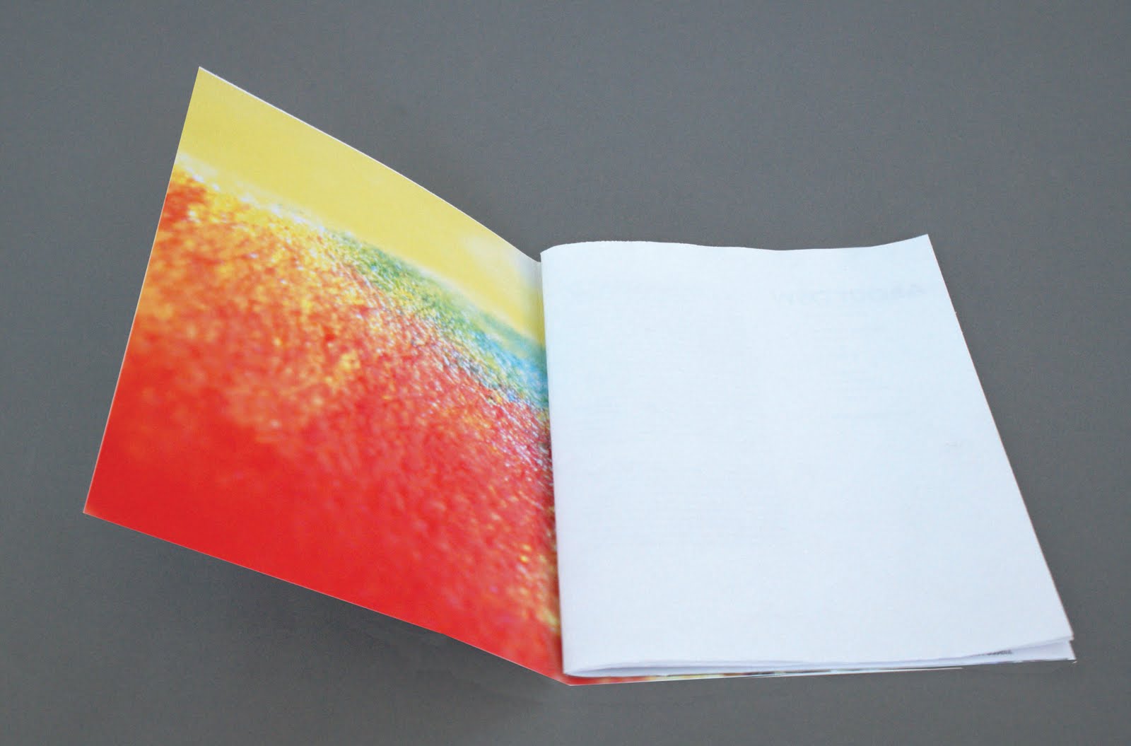
I worked on this as a splash page/ nice bit of colour that ties the book together and unites it with the rest of the stationary. If there's enough pages left over at the end, then this is definitely an option that I can go with.

Then I started playing around with titles and layouts but it was all a bit aimless really, Daisy wasn't able to give me much of the information I needed and I need her to send me some much better quality photographs if I'm going to produce the kind of high standard she wanted. What I do like about this start is the change in weights of the title, highlighting the About bit of the title. It kind of reminds me of the way with compliments was layed out on the compliments slip, which creates a nice bit of parity between the stationary and the booklet again.


One spread I was able to work on quite extensively and quickly was the alpha and omega t-shirts because they were a project I actually worked with her on, designing the prints for the garments she designed. I started with the title and again mimicked the with compliments slip. The images themselves created quite a nice mirror, so i started with a layout that reflected this, with the brief summary of the work mirroring the title. I tried a few other things out before deciding that I was really onto a winner with using the mirror idea. With that in mind, I reversed the photo on the right to further this effect even more. I think the themes of opposites in life and death are then reflected quite nicely in the mirror layouts.


Spurred on, I went back to the abouts page and contents. I decided to put in the picture that I'd extracted the colour from to make the compliments slip. The problem with this is that if I use that full colour splash page, then perhaps it's too much. It was also difficult to lay out the text on the page without the image behind really interfering with it.


The text I've been using throughout the body copy is 7 pt century gothic with +10 leading and 10 pt line spacing. This should be very readable but I'll obviously check this at a later date with some mock-up prints.


Finally, a mock up of a double page full image spread, but I'm not sure whether there will be space to do this kind of thing when all is said and done.


After doing most of this over yesterday, I realised I was quite confused and aimless and I needed some further direction so I had a meeting with Daisy this morning, where I went over exactly what she wanted in the book, and gave her apiece of paper with all the file requirtements on it: CMYK, 300dpi etc. below is a piece of paper where she's ordered the work she wants in the book into pages and she also wants the thign divided into sections, such as garment design, make-up/styling and art direction which I think is a very good idea, though this booklet is getting bigger than I initally thought it would be, meaning it may have to be 4 separate pieces of A3 paper folded down to A5, or 2 A2's done in the same way. It's good to have a road map and I'll stick to this untill/if it throws some problems up.