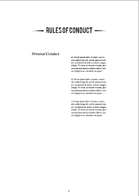


Here is the grid I used, consisting of 6 columns and 8 rows both with a gutter of 4.33 mm


I started with the contents and the FAQs on the same spread, but I realised this looked to cramped and i had space to spare so I laid them out on separate more spacious spreads.


I picked the six column grid mainly for the way it would make the rules and regulations spread look, with the section and then the rules lying in separate sets 2 columns wide.


After laying out those previous spreads above, I looked at the contents page and decided that it looked a bit empty, this was the perfect place to put the logo in to make the pages parallel and create a balanced looking spread.


I then decided that the ornamental pieces found under the word member in the membership cards would stop the spreads from looking quite so bland and began adding them as a divider between title and content. I think it works pretty welll, they don't seem to detract from any of the content at all, or interfere with the hierarchy.


No comments:
Post a Comment