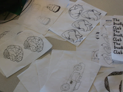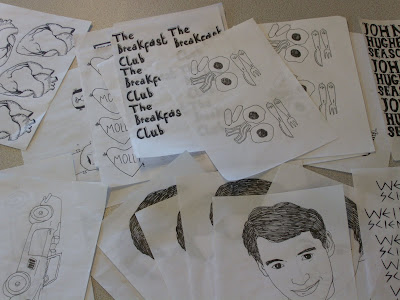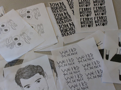


Here is my progression on The Ferris Bueller Ident. I looked at the way Ferris Bueller looked in the stop-motiony bit in the video I put up for my final crit, I realised that potentially the fact that it looked reversed out made him quite unrecognisable, so instead I put it the right way round and used a white outline round his head to seperate him from the red circle.
So here is what I planned pretty much, except I cut the third 'bueller' form the sound file because it was too long, I don't think it takes anything away from it having it just twice, infact a third time would be too repetative.
Here is the standard 'John Hughes Season' text, I'm going to use the same one for every Ident for two reasons; it creates a continuity between the ident and it also saves me alot of time that's becoming an increasingly precious commodity at the moment.
This is just to demonstrate something I need to remember when exporting or I'm going to have some dire looking movies, I forgot to change the render from third to full quality when exporting it.
Here I've added the Film 4 section, I tried to make it move, however, I think that that, combined with the motion of the stop motion just makes it hard to read the text because your eyes are focusing on the lines zipping everywhere.
Here it is, not moving, however I realise that it looks wrong and the lines need to read as a 4, which they don't with the horizontal line going right across the circle.
I asked both my housemates if they could read this as film4, thankfull it passed the test, and here we have a final Ident.
Here is my progression for the Breakfast Club Idents:
t.
Here is my attempt to use that eating motion as a replacement for a fade out or a motion out of the circle. I thought that it was quite a nice clever Idea, however I thought the Molly in a loveheart at the beginning was starting to seem flabby and unneccassary.. I also thought it might be a little confusing, even to those who are familiar with the films, just incase they arn't familiar with John Hughes icon Molly Ringwald.
I initially started trying to use the last lot of storyboards I drew to sort of create a summary of the film almost, but I realised 2 things, firstly that it was incredibly dull to do it this way, and also th epeople who would be interested in this season already know the plots so it's not exactly interesting for them. So I thought a little whle, and using the components I already had, i decided to make a series of pictograms that represent the films, so following on from this video, I began focusing in on the breakfast,a nd using the experiment I did for my final crit with the breakfast being eaten, I thought that would be a nice little image to create a quick, simple and to the point ident.
And Here's how I progressed with weird science:
These are again, like the early breakfast club and sixteen candles videos, attempt summarise the plot points of weird science i.e. science (symbolised by test tube and conicle flas, frankenstein and a bra that symbolises the sexed up nature of the film. On the storyboard it seemed to work but after some progression with ti, I realised that I detested the way Frankenstein's head looked and that the Bra was uneccassary, arriving at a similar sort of Pictogram stage that i did with the other idents. I used an arcade game sound effect to soundtrack the changes in frmes, which ended up being the only thing I liked about the initial videos.
Here I looked at the Icon and the way it could move out of the way for the 'Weird Science' text. I didn't like this one above because it seemed too slow.
I tried using the technique that I'd used at the beginning, having the text shoot on from the bottom of the screen, I thought that it gave it a dynamic kind of feel that seemed appropriate to the film and so I stuck with it.
And here's a quick pr0gression on 16 Candles:
Again, I diligently started putting in all the compoistions I would be using to represent sixteen candles, when it seems kind of redundant and unnecessary to my concept.
I quickly thought about how effective it would be to use the candles as a pictogram for it. Thinking to the way the sounds worked in the Breakfast Club and Weird Science, I was hit by a wave of inspiration and thought that the sound of breath blowing out the candles could be really interesting, unfortunately the sound I got wasn't quite right but it was the only one I could find. I tink it still works effectievly enough and the fading out of the candles sort of eludes to the candle going out slowly.
And from here, my entire plan for the John Hughes Movie Season section changed, after I realised that having symbols summing up plot points looked a little weak, I realised that it was best to have a summary ident one that carries all of the information in the other slides, allowing the viewer to know what every film in the season was, in one showing, here it is:
Initially I started by putting in the components, using the other Idents to inform the layouts, theres no transitions on this one like a fade out etc, which makes it quite difficult to follow because eveyr change is jarring.
I added fade ins and outs because I needed to see whether that would make the animation run smoothly, it was a success and I decided tostick with it because I really enjoyed the way the circles sort of changed colour slowly, over the next few I tried to exaggerate this a little bit more. I chose the Beatles twist and shout as the accompanying music, I was initially going to use Don't you Forget about me, like in The Breakfast Club, however, I decided not to for two reasons, firstly I didn't want to repeat myself, and secondly, I didn't want something that slow, I wanted more of a celbration of the movies. Twist and Shout is from the iconic Parade scene in Ferris Bueller's Day Off. Listening to the song, I though the break down bit was perfect, the way the harmonies increase works beautifully for the visual changes, every time the film changes, the harmony changes and I think it has a nice synchronicity.
It came together pretty quickly and quickly organically, here I've tweaked timings a bit, mainly with the fade ins and outs which youtube has thoughtfully cut off, thinking them unneccassary, as is there want.
No comments:
Post a Comment