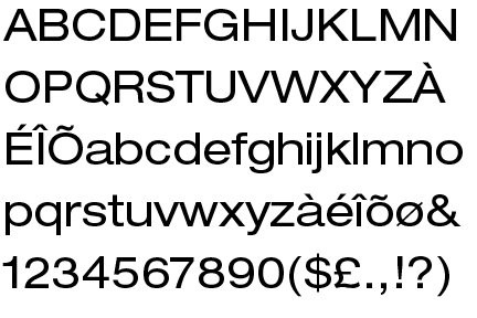
Right initially, with this idea, I thought about how the article it's self is humorous whilst remaining kind of 'proper' and middle class, which is why I based it so heavily in a traditional looking font as a pose to the quite hand drawn fonts I've used in the other two. I decided that contrasting the straight-laced nature of the font with it's new furry exterior would be a nice juxtaposition that would kind of give a similar sense of humour as the article.

I initially decided to place it in a speech bubble to go along with the 'doesn't speak bit' however, I think that it looked bloody terrible. The shape doesn't and will never lend it's self to the format, I then decided that this part was kind of unneccassary anyway and that I should let the type speak for it's self.

I tried variances on brown and orange to simulate traditional cat colours. Te orange as a background colour is too bright.


At this point i'm split between orange on white and white on brown. I asked Ollie and Tom and they both liked white on brown the best, so this is what I shal print tommorrow.
No comments:
Post a Comment