I quickly brainstormed keywords that the title drew to mind. I thought this would be a quick way to generate appropriate imagery.

An initial response was typographical, I thought of the word virus and the idea of the v being the mouth of the virus sprang to mind, here is a few manipulations of this idea in illustrator.

And here I have turned it into a form suitable for the article. I tried it with just one of them and then with another 'virus' but thought it looked best as the 3.


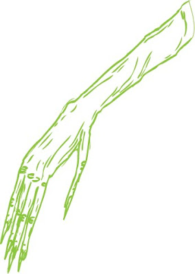
However, in reality, I wasn't particularly happy with this outcome. I think it's ok, however it's not particularly inspiring to me as an image maker. Onto my second idea: I had the idea of a withered hand, representing the ideas of age and withering within the title.
 It was weird in that, when I said withered hand, Amber and several others pictured an extremely similar image, I like it's apparent universality and promptly headed in this direction

 I think I like it best all distressed and weathered, it kind of makes the image look frail and withered as a whole, rather than just the hand, or at least this is the effect I'm going for anyway.
 For 'this column will change your life' I did some very quick sketches in my sketchbook of the earth and the moon close to each other with some comment about the distance and the big figures. I thought I'd replicate this quite quickly using photographs of the earth and the moon, using Photoshop to make them appear distressed. Finally I added a few figures in between the two to make it relevant to the text. Although it was developed quickly, I actually quite like the simplicity of this piece, though I'm not sure it's what you'd typically find in the Guardian.

Here it is in context with the icon, which I'll discuss in the next post.
Finally here is the Tim Dowling one, I really, really struggled to be inspired by this one, even though the content is rich in funny visuals, so I scanned a drawing and put it straight into the article. I don't think it works very effectively, it doesn't quite balance out with the text well enough, but unfortunately I've run out of time.

No comments:
Post a Comment