The ones below are me searching for a colour that goes with John Hughes, I liked the yellow, but at the crit last week, the yellow's visibility was called into question. On reflection, the mustard i started with is possibly the one to go for. I got the John Hughes picture by extracting it from a very popular photography portrait of him, i think theres something iconic about it.


Below is me working my way through the imagery for 16 candles, I've tried variations of pink because i think it's the most appropriate colour to represent a girl orientated teen comedy. I selected the image from the film poster/DVD cover of the time because it will have a familiarity with the audience from the 80's and shows recognizable characters from the movies that a modern audience would understand.

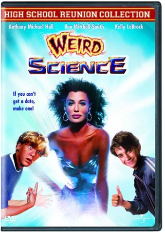
For weird science, I though that a green would be apropriate so her I've just explored a few different greens, I like it muted becase it sort of matches the muted blues and pinks from the other idents. The typography is a variation on the typography from the DVD cover

All being well, if the detailed storyboarding of 'The Breakfast Club' ident works, then I can start developing this imagery.
No comments:
Post a Comment