I'd like to start this module evaluation on a positive note before you're hit by a deluge of self deprecation and worry; I found this module to be the most enjoyable to work on, more so than any throughout the years to date. My personal circumstances have become far more manageable and I was able to avoid that interfering with my study and progress, giving me more confidence and allowing me to manage my time in a far more meaningful manner than previous years. I'm happy with at least 75% of the final outcomes produced for this module, and if it's aim was to create a portfolio that can be used to land work experience etc. then I believe that the module has been pretty successful for me.
Now for a more critical evaluation of the progress I've made throughout the module; my time management has been more successful than before, and I put this down to keeping a reasonably thorough project management folder, where there are few days since beginning the module where I haven't detailed the jobs I need to get done. Now I'm not saying I was able to stick to all the deadlines I'd set myself in these action plans and on occasion, the deadlines I've set myself in the briefs have lagged on, either through my own fault or because the client themselves (as in the case with the DSW brief) was hard to keep up with and a lot of schedule conflicts meant that meeting the client and discussing the project was harder to maintain. I am saying that constructing these deadlines and then even restructuring them did allow me to keep on top of the projects, more so than before. As always, there is room for improvement; I need to learn to set myself more realistic deadlines, and this probably will stem from measuring time in units more accurately and I guess this module has taught me a lot more about realistic deadlines, and also trying to account for the unaccountable with more accuracy; what happens if the prints go wrong? (as they did, frequently, in the cults brief)what if the digital print room has no space? Can I realistically work at the weekends when I'm looking after Tilly, or am I going to have to make that time up somewhere else in the week. This is something I'm definitely going to focus on for the FMP in order to get the most out of it: I think a lot of these problems can be solved if I spend some time at the beginning of the module just thoroughly planning my time and putting systems of recording into place that mean that there isn't a rush at the end to re-organise what I've been doing so far.
Something else I feel a little disappointed in myself about, and this relates to time management, was that I only got 5 briefs done, one of those being a quick day brief. Doing the day brief it's self towards the end of the module made me realise how quickly I can make decisions and resolve pieces. For the FMP it is my aim to take on more small briefs running concurrent to the larger briefs I'm working on. Not only will this provide me with a greater range in my portfolio, but it will break up the major briefs when they're starting to bog me down.
In terms of the actual design work I've been producing, I feel happy with the general standard of work I've been putting out, along with the strength of ideas I've been working with. I feel that I have a genuine understanding of the way typography works and feel very comfortable employing it, more so than my time spent as an illustrator. However, I do feel that I have been more narrow with the design directions that I've been working with, I find it difficult to surrender myself to a creative process where I try so many different things and I get too attached to a singular idea. I need to learn that in the initial stages, these ideas are throwaway and it's only on reflection after this initial process that I can truly find the best design solution. This is something that I need to learn for the FMP, I'm going to do this by doing more hand drawn, quick, sketchy and quite possibly terrible initial design sheets. My design process so far has negated the significance of these sheets, but I think in terms of getting a broader spectrum of ideas, I'm realising more so than ever how vital this stage might actually be. I think I learned this in the day brief for ISTD where I did maybe 3 design sheets of different ideas and development of one which allowed me to really springboard into a rapid process of design.
Part of my rationale was to look at print and finish processes, something I really wanted to do, and a few of my briefs, particularly the Cults brief allowed me to really look at the way this works, not just in terms of unique inks and foiling etc. but also with paper stocks and folding. Unfortunately, as much as I like working with this kind of thing in mind, I am not the best screen printer in the world and my prints suffered for this. I look forward to a time when I can employ these techniques by collaborating with a printer, perhaps this is something I can look at into the new year as part of the PPD module.
In terms of getting live briefs, I managed to secure a few for this module, but I would love to do more, I really enjoyed working for a client and I think this relationship is an important one to learn more about. Now I have a portfolio of work I'm pretty happy with, I feel much more confident pursuing this kind of brief. In this way, the module has been successful but as said previously, there is always room to take on more live work. Up to this point, I've shied away from actively pursuing this, perhaps because of some kind of worth issue, but this module really has given me the confidence to the point where as part of the FMP, this will not be a problem.
In conclusion, this module has been extremely good for me and essential in my development, not only in terms of design as a set of skills, but design as a full working practice and potentially a working business. The actions that I've outlined in this evaluation will allow me to capitalise on the things I've learned over the course of the module will stand me in great stead to produce a large volume of high quality work for my final major project.
Tuesday, December 14, 2010
Presentation Boards
Here are the presentation boards for each projec, plus a brief explanation of the information I've given and why.
So with the Manchester Book Fair, I included a splash board that had a summary of the concept and audience etc. A shot of all the products I produced, including a close up on the spot varnish detailing on the cover, some shots of the spreads, where I've tried to highlight the spot varnish finish. It was difficult to photograph so I've handed in the product as well. I've also produced a board that highlights the extra materials. What I haven't included, quite deliberately is a context shot of the book at the book fair, no one needs to see a photo of me and whoever manning a stall to emphasise the point of it in context, it felt like a waste of a board.
DSW has a brief summary of the lgo, her audience and the concept etc. Before looking at the stationary range I produced, then the press release booklet I've made for her and finally the website I've mocked up for her, all with type specification information.
The cult brief was specifically about type and layout/ print and finish, so I documented each one of the different finishes I used on the boards a long with a detailed type specification. There was intentionally no context to avoid limiting myself in terms of what prints and finishes I could use.
The membership pack brief simply has a splash page for each organisation followed by shots of the stationary for each membership pack. This has a type spec a long with colour swatches included in the information.
This was a day brief so it has a quick summary of that as a concept, a board on the pysical release and a board on the digital release.
Open publication - Free publishing
So with the Manchester Book Fair, I included a splash board that had a summary of the concept and audience etc. A shot of all the products I produced, including a close up on the spot varnish detailing on the cover, some shots of the spreads, where I've tried to highlight the spot varnish finish. It was difficult to photograph so I've handed in the product as well. I've also produced a board that highlights the extra materials. What I haven't included, quite deliberately is a context shot of the book at the book fair, no one needs to see a photo of me and whoever manning a stall to emphasise the point of it in context, it felt like a waste of a board.
Open publication - Free publishing
DSW has a brief summary of the lgo, her audience and the concept etc. Before looking at the stationary range I produced, then the press release booklet I've made for her and finally the website I've mocked up for her, all with type specification information.
Open publication - Free publishing
The cult brief was specifically about type and layout/ print and finish, so I documented each one of the different finishes I used on the boards a long with a detailed type specification. There was intentionally no context to avoid limiting myself in terms of what prints and finishes I could use.
Open publication - Free publishing
The membership pack brief simply has a splash page for each organisation followed by shots of the stationary for each membership pack. This has a type spec a long with colour swatches included in the information.
Open publication - Free publishing
This was a day brief so it has a quick summary of that as a concept, a board on the pysical release and a board on the digital release.
Labels:
Cults Brief,
DSW,
Fakery,
Manchester Book Fair,
Membership Pack Brief,
OUGD301
Monday, December 13, 2010
i-Phone Application
Poster Context

Here is my poster design. I think it looks quite visually engaging and it's certainly a point from which I can develop if I want to reloook at this brief in the near future. I guess I feel a little odd about it because it's such a rapid turn around, I'm not sure if I could be doing more with it, or less with it, or whether it may actually not work and I've somehow deluded myself, but alas, with little time left now, I'm going to have to mock up a digital solution.
Web Of Mass Deception colourways
Web of Mass Deception
http://whatreallyhappened.com/WRHARTICLES/WMDlies.html
In my research I stumbled upon this website which is really useful, it's rich in the kind of content I need for my poster, so I'm going to use this as a source for the majority of my design piece. The concept is to expose the web of lies generated so America could go to war with Iraq across a timeline. It's set across a circular grid in order to create a visual similar to a web and to cause people to spin the page round in a fashion similar to a web being weaved.

I began laying the text from it in a 3 tier circular grid system. I used the flat earth model I'd created for the membership pack brief as a basic grid to work with.

I began laying the type into the tiers as stated before; text from the website that involved only the conspirators, text that involved lying to other governments and then finally on the outer tier

On the outside I put the dates of the start and end of the iraq war to give people a better idea of when events occurred.
I used a dotted circular line to point out these 3 layers of lying that I'd already mentioned.

I tried labelling them in the manner below, but it looks really sloppy, so I'm going to try something else like a key.

Here's the key, I think it works better, this is the grid I'm going to use to lay out the type around it.


I had a brief go at designing a logo that was unusual, trying to use the curves and straight lines of a web to make letterforms, but it looked really ugly and so I stuck to a simple helvetica logo that matches the typography of the rest of the content.

Heres the lgog in the centre of the web. I like it's presence there conceptually, but it's too small realistically, and it kind of jumbles the web a little bit.

With the circles around the web, I initially started with a system of green, amber and then red, but I don't like it's connotations of traffic lights, and it also seems to say acceptable, less acceptable and then unacceptable, rather than suggesting tears of lying.

So then I went for a series of shades of reds, the signifier of negativity.


Changed the lines to dotted to reflect the circular lines in the actual diagram beneath.

I put the title in a header format along with a short summary of what the poster is about in 12 pt. I think this makes it a more cohesive piece of design, where the reader can interpret the information presented to them with more clarity.
In my research I stumbled upon this website which is really useful, it's rich in the kind of content I need for my poster, so I'm going to use this as a source for the majority of my design piece. The concept is to expose the web of lies generated so America could go to war with Iraq across a timeline. It's set across a circular grid in order to create a visual similar to a web and to cause people to spin the page round in a fashion similar to a web being weaved.

I began laying the text from it in a 3 tier circular grid system. I used the flat earth model I'd created for the membership pack brief as a basic grid to work with.

I began laying the type into the tiers as stated before; text from the website that involved only the conspirators, text that involved lying to other governments and then finally on the outer tier

On the outside I put the dates of the start and end of the iraq war to give people a better idea of when events occurred.
I used a dotted circular line to point out these 3 layers of lying that I'd already mentioned.

I tried labelling them in the manner below, but it looks really sloppy, so I'm going to try something else like a key.

Here's the key, I think it works better, this is the grid I'm going to use to lay out the type around it.


I had a brief go at designing a logo that was unusual, trying to use the curves and straight lines of a web to make letterforms, but it looked really ugly and so I stuck to a simple helvetica logo that matches the typography of the rest of the content.

Heres the lgog in the centre of the web. I like it's presence there conceptually, but it's too small realistically, and it kind of jumbles the web a little bit.

With the circles around the web, I initially started with a system of green, amber and then red, but I don't like it's connotations of traffic lights, and it also seems to say acceptable, less acceptable and then unacceptable, rather than suggesting tears of lying.

So then I went for a series of shades of reds, the signifier of negativity.


Changed the lines to dotted to reflect the circular lines in the actual diagram beneath.

I put the title in a header format along with a short summary of what the poster is about in 12 pt. I think this makes it a more cohesive piece of design, where the reader can interpret the information presented to them with more clarity.
ISTD Fakery Brief
Because obviously time is running out and I still want to do this brief, I've rewritten it to have a 24 hour time limit to produce a printed resolution and a digital resolution. Whatever I get done in that day is the final outcome, this will give me something to springboard off of if I want to continue this as an expanded brief in the next module. Here is the brief to accompany the official ISTD brief:


Wednesday, December 8, 2010
Rules and Regulations book, Order of The Magi
This booklet was easier than the other too, I'd decided to use a similar layout throughout the rules and regulations booklets so it was a case of substituting appropriate content fonts and logos.


Similarly to the other two books, I decided to have the opening page devoted to the motto of the society or at least a positive set of phrases that represent the society well, for example, the quote here isn't from an actual motto, but a nice little phrase at the end of their about us section, which carried the mystery and ambiguity about magicianship that made them as a group seem really interesting.


The layout and grid is the same as the others, a key difference is the presence of the logo on each individual page, This was done because it created balance in a similar way to the tools on the guild of taxidermy page and the little floral decorative pieces on the flat earth society booklet.


Similarly to the other two books, I decided to have the opening page devoted to the motto of the society or at least a positive set of phrases that represent the society well, for example, the quote here isn't from an actual motto, but a nice little phrase at the end of their about us section, which carried the mystery and ambiguity about magicianship that made them as a group seem really interesting.


The layout and grid is the same as the others, a key difference is the presence of the logo on each individual page, This was done because it created balance in a similar way to the tools on the guild of taxidermy page and the little floral decorative pieces on the flat earth society booklet.

Tuesday, December 7, 2010
Rules and Regulations book, flat earth society
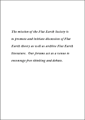
I started trying to lay out the motto of the flat earth society as a nice introduction to the society and the way it works. I experimented with a few layouts using both bebas and adobe caslon from the logo before deciding that Caslon looked the most appealing of the two.


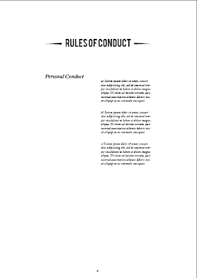
Here is the grid I used, consisting of 6 columns and 8 rows both with a gutter of 4.33 mm


I started with the contents and the FAQs on the same spread, but I realised this looked to cramped and i had space to spare so I laid them out on separate more spacious spreads.


I picked the six column grid mainly for the way it would make the rules and regulations spread look, with the section and then the rules lying in separate sets 2 columns wide.


After laying out those previous spreads above, I looked at the contents page and decided that it looked a bit empty, this was the perfect place to put the logo in to make the pages parallel and create a balanced looking spread.


I then decided that the ornamental pieces found under the word member in the membership cards would stop the spreads from looking quite so bland and began adding them as a divider between title and content. I think it works pretty welll, they don't seem to detract from any of the content at all, or interfere with the hierarchy.


Here is the grid I used, consisting of 6 columns and 8 rows both with a gutter of 4.33 mm


I started with the contents and the FAQs on the same spread, but I realised this looked to cramped and i had space to spare so I laid them out on separate more spacious spreads.


I picked the six column grid mainly for the way it would make the rules and regulations spread look, with the section and then the rules lying in separate sets 2 columns wide.


After laying out those previous spreads above, I looked at the contents page and decided that it looked a bit empty, this was the perfect place to put the logo in to make the pages parallel and create a balanced looking spread.


I then decided that the ornamental pieces found under the word member in the membership cards would stop the spreads from looking quite so bland and began adding them as a divider between title and content. I think it works pretty welll, they don't seem to detract from any of the content at all, or interfere with the hierarchy.


Subscribe to:
Comments (Atom)


