

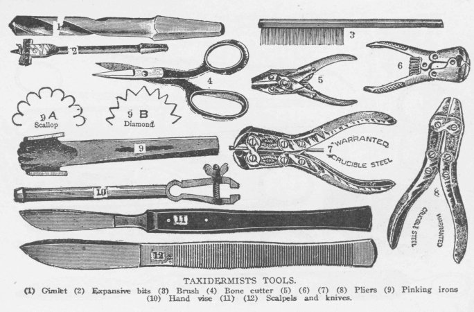
I immediately thought that turning these into a series of intricate vectors that are laid out well could create a very unique and interesting identity for them. SO I set about tracing the mot interesting of them, I left a few out because they were very similar to other tools I'd already done, or they didn't lend themselves well to becoming a vector. I played around with a few different typographic approaches and had Craig on hand to give me a few different ideas about typographic approaches, I looked at condensed fonts and deco style fonts because they always spring to mind with these very simplistic almost screen print style 2 colour imagery. Something wasn't working about them, so I looked at goigng the other way, with a very thin weighted font, with a very large leading, so I looked at Gill Sans light at a leading of almost 300, using lines above and below the word taxidermist to anchor the widely tracked lettering together, without it looking too sparse and disparate.


I looked a little bit at colourways but I obviously need to explore this further, but this gives me one really strong direction I can go in, because it says craft and skill, it speaks directly to my audience who have a special understanding of taxidermy tools and it's a lot more inventive than what they seem to have: http://www.taxidermy.org.uk/
Anyway, on with more design directions.
No comments:
Post a Comment