Here is some research into symbols that were appropriate that I did from the extremely badly laid out symbols.com
Appropriate symbols for 'splash pages' although I use that term loosely:
Neptune

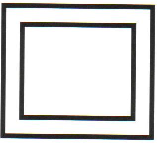
Square Within A Square
Heiroglyph for contain

For Truth:

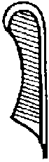
Ma'at Feather
 (I can't seemt o find it's symbol.com page but it means truth and law.
Saturn

Native American:


Perthro Rune

Conspiracy:
I started work on the first 'splash' page, looking at different images that would take up most of the page. I wanted to keep the column where the page number free because I thought it left an interesting dynamic throughout the book. I started with the hand image that I'd used for the book covers that didn't really pan out. I thought it looked quite interesting, but it didn't really work conceptually in this context either. I then started applying stock photos of space that I thought were really visually engaging when made into duotones like the rest of the photos. I thought that this linked in with the concept in terms of a cosmic attitude to lies and truth that the symbols I'd been chosing represented. I felt that using this type of imagery at both ends of the book would act as great bookends for the book, creating a parallel between beginning and end. Initially I started with halftoned images, but I felt that because nothing else in the book so far was halftoned; I felt this would be quite jarring with the rest of the content, so I spent forever and a day finding a couple of space images that were large enough to fill an A3 page without reducing the quality.


And with the appropriate symbols for concealment and lies put over the top, ready for spot varnish:

Hidden Truth:
Hidden Truth splash came together about as quickly as the other one. I just mimicked it with a slightly different space background. Again representing the cosmic principles of the symbology I'd used. The difference between the two i that the words 'Hidden Truth' are also spot varnished on this page, creating a nice parallel between the concepts of the book, and responding visually to it's themes.


I appreciate this doesn't look like a lot, unfortunately I'm ding this whist looking after a child full time for the week, this has severely hindered my ability to document throoughly. I'm a bit disappointed because it means I'll probably lose a lot of marks. I might come back to this towards the end and re-document what I can find.
No comments:
Post a Comment